Tuesday, October 20, 2009

AUTUMN IN TUSCANY


(Click to enlarge)
Top picture: Front and back covers of journal when closed
Second picture: September page and "inside cover" of journal
Third picture: October and November pages


While cleaning out my closets for my rummage sale, I ran across these pieces. I had submitted them to Somerset Seasons magazine for one of their themed-submission invitations.

These items were rejected by SS and returned to me. I was devastated. As much as I admired the magazine, I never submitted an entry to them again. What hurt the most is not the rejection but the reason for the rejection: that my entries did not fit their theme. The theme: Autumn in Tuscany. Now, I ask you, why do these not fit the theme? I'm not saying my entries were any good, but they were created especially to fit the theme, and I think in that respect I followed through.

I was especially ticked that some of the entries they published in that issue had themes which had nothing to do with Autumn in Tuscany (Native American, for example).

For the accordion book - The Travel Journal of Millicent Mowbray - I created a tryptich on the front and back sides for six pages total. For the September and October pages, I show a turn-of-the-century lady on her grand tour of Italy in Autumn 1912. On the December page, I show her back at home, writing her memories and creating her scrapbook.


(sorry, I cut off the top border in the scan)

For this picture, Autumn in the Vineyard, I created a vignette of grapes, sunflowers, cypress trees, a lady in a hat with sunflowers and a table a deux with vino. Is that not quintessential Autumn in Tuscany?


My third entry was the Italian Fever collage I have already posted on this blog. Okay, maybe this one is a stretch, but it does feature autumn colors, fall leaves and nuts, and harvested figs, pears and grapes.

Thursday, April 2, 2009

AND AGAIN, MORE COLLAGE POSTS


For my dear friend Lila, who loves "Mamma Mia"


"WHERE ARE THEY NOW?" (VERSION II)
(The little girls we once were)


"TAGS"


"HERE'S THE SCOOP" (using table napkins)


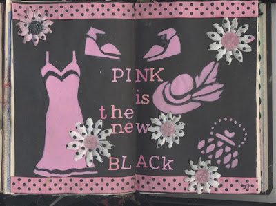
"PINK IS THE NEW BLACK"
(for Lila and Carmen)

STILL MORE COLLAGE POSTS


"COME AND SEE MY SHINING PALACE
BUILT UPON THE SAND"
My tribute to Edna St. Vincent Millay


"MERMAID MUSINGS" for my dear friend C.N.


"MERMAID PAPER DOLLS" for my dear friend Lila


"MARY OLIVER QUOTE, OVERLEAF"


"MARY OLIVER QUOTE"


"MILLAY'S SHINING PALACE" VERSION II


"GRACE"
(The light and dark lines do not show up on the original)

MORE COLLAGE PAGES


"WHERE ARE THOSE LITTLE GIRLS?"


"FLYING DREAMS"


"EUROPE BECKONS"


"CARL SAGAN"


"A DAISY SUMMER"

(In memory of our dear late blogging friend "Daisy Lupin")


"CROW TOTEM"


It was difficult for me to "give away" some of these pages. I knew, when I did them, that they would be going around to all the round robin members and finally to the altered book's original owner. I had saved some of these images for a long time. But then I realized that I do have copies of all of them and that is, in a way, almost as good as the real thing. For in these images, one cannot see the globbed up glue spots, the hesitancy, the repositioning, the "do-overs". As long as Blogger exists, my work will exist!

CATCHING UP


"FEATHERED FRIENDS"


"SAGE WOMAN, PAGE I"


"SAGE WOMAN, PAGE II"


"WILD WOMEN"


"A LEONARD COHEN LADY"


"CLAIRE"


I have sorely neglected this blog (as I have my book blog). Truly, what I have learned, belatedly, from other bloggers, is that it is hard to maintain one blog, let alone three.
These pages are from sets of pages (some how I always had to work in sets of two) I did for a round robin collage among six of us artists from March through August last year (although I really cringe to call myself an artist). I can't believe how prolific I was at that time. I have not gone into my "art studio" since last fall, when the challenge was finished.

Friday, March 28, 2008

PORTALS


Top: Altered book "Portals" double pages, left side.
Bottom: Altered book "Portals" double pages, right side.
**********
At last, a set of pages in my altered book that do not revolve around a song! I have always been fascinated with portals, or doorways. What mysteries lie beyond these portals? Shall we take the chance, or shall we be safe and pass? We may, like Mary Lennox, find a Secret Garden. Or, we may unleash a horrible monster.
I remember reading, in grade school, the story of "The Lady and the Tiger". If the protagonist chose the correct door, he would find his lady love. However, if he chose the wrong door, he would be devoured by the fierce tiger behind the door.
Even into the 20th Century, game show participants had the choice of gifts behind "Door Number One, Door Number Two, or Door Number Three?"
I love the golden, antique white and brown tones of these pages, but am once again dissatisfied with the stark white behind the words. I will probably rub on some ink pigment here as well.
NOTE ADDED LATER: I went back and rubbed some stamping ink over the printed words and part of the pages as well. It is "Vanilla Bean" Vintage brand ink and works extremely well.

A SPRING CLEAN FOR THE MAY QUEEN


Top: "Spring Clean for the May Queen" altered book double page, left side.
Bottom: "Spring Clean for the May Queen" altered book double page, right side.
**********
I mentioned in my previous post that I consider "Stairway to Heaven" to be the best rock song ever. Why then, should I not create at least two double ages in honor of the song? What I love so much about "Stairway" is that it is at least three or four songs in one. It starts very slowly, almost as an English folk ballad. By the end, it's as head-banging as a rock 'n roll song can get.
In these pages, I tried to capture the mystical, whimsical side of the song, in which the fairies/fae/wee folk have a spring cleaning in the forest for the "May Queen", or the Queen of Beltaine (May 1, the beginning of spring for the Celts).
I love that there there is a bit of threat in the song: "If there is a bustle in your hedgerow, don't be alarmed now." Is it just a hedgehog or hare? (I'm going with English imagery here, in honor of the members of Led Zeppelin.) Or will the Queen of the Fae, as legend goes, freeze you in her glance and cart you away to fairyland forever?
I love the little winged girl. I can just imagine her tinkling laughter as she secretly flits among the trees. Did you really hear her, or is it just bird song?
The foxgloves are from a greeting card I received years ago - a great way to recycle it, I think. As with the other "Stairway" pages, I will probably obscure more of the background and tone down the paper the verses are printed on.
NOTE ADDED LATER: I went back and obscured the background and verse borders with lavender acrylic paint.

A STAIRWAY TO HEAVEN


Top Photo: "Stairway to Heaven" altered book double page - left side.
Bottom Photo: "Stairway to Heaven" altered book double page - right side
**********
Honestly, I really did not set out to have most of the pages in my altered book be based on song lyrics. It just turned out that way. This is the third song in the book, "Stairway to Heaven". Performed by Led Zeppelin, it's the best rock song ever, in my opinion.
Here, I have left a lot of the words of the original book showing, but that may change before I send it out to the next round robin participant. I am also not thrilled with the stark whiteness of the paper behind the lettering. I may "subdue" it a bit by rubbing some rubber stamp ink across the lettering.
I re-worked these pages many times until I was ultimately (somewhat) satisfied with them. They started out as pages in my visual journal. In fact, I have re-worked and re-worked them to the point of hopelessly damaging one of the original images.
I wanted my emphasis here to be on a type of woman who is, I believe, the antithesis of me. I am definitely not a person who thinks she can always get "what she came for", and I am not a material girl. My message to her is subtle, but there: "Your stairway lies on the whispering wind."
It's funny what you see after the fact. After I scanned and posted the left page, I could see that the "Dear Lady" phrase was crooked. This really bugged me, so I went back and re-did it.
NOTE ADDED LATER: I went back and altered the lettering with "Vanilla Bean" Vintage-brand ink (looks golden). I am very pleased with the results.

Tuesday, March 18, 2008

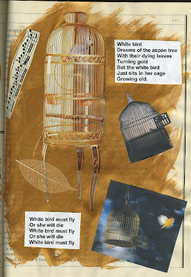
WHITE BIRD


Top: "White Bird", left-hand page (not
that stray piece of paper again!!)
Bottom: "White Bird", right-hand page


This is another set of pages in my altered book. I don't know if I really have the altered book concept down pat - I covered up 95% of the words in "Suzanne", and about 99% of the words here.

I actually did these two pages first. I learned a couple of important technique pointers: Don't lay down too much paint, and don't just stick the clipping on the wet page (it wrinkles!!).

I don't know how many people know the song, released in 1969 by It's a Beautiful Day. It's really quite a dark and melancholy song, though extremely beautiful. I haven't actually heard this song for maybe 30 years but it has never left my mind.

SUZANNE

Top: Left Page (There is no piece
of paper on the plant - scanning error!)
Bottom: Right Page


These are my first efforts in the altered book realm. I wrote a post a few days ago in my regular blog on the subject of Leonard Cohen's song, "Suzanne." Here is the artistic representation of the emotions the song stirs in me.

I wanted to give it a very boho feel, both with interior and exterior scenes. I featured six women, all of whom are facets of Suzanne, who, is believe, is a part of every woman. I used acrylic paints, magazine clippings, computer printouts and, a Post-It note. I realized there was too much blue so I brought in green at the end.

Wednesday, March 5, 2008

ACCORDION BOOK

As you can see, while I was enrolled in my visual journaling class last year, I was very prolific and motivated to produce art. My job ended abruptly just about the same time the classes were over, and I lost my motivation. I lost hope.

I found this accordion book on sale for $2.50 at Hobby Lobby and used it as the basis of a series of variations on the theme of Emily Dickinson's "Hope" poem (see previous post).
There are still many pages left in this accordion book, and I still have lots of images to use. I would dearly like to regain my motivation - and my hope - and finish the book.

Below: My hopes for 2007. Some came true, some didn't.


Below: Emily's poem and her portrait.


Below: Front cover with metal "Hope" plate and ribbon and bead trim.


I used a lot of browns and other subtle colors because I always think of Emily Dickinson as being a shy, quiet, even drab wren. But Emily, like wrens, could trill the most beautiful notes when she wanted to.

ITALIAN FEVER


(Click on picture to enlarge)

I sent this piece along with two others to a magazine, the first and only time I have ever submitted anything for publication. All three were rejected. I was prepared for rejection, but not for the reason they stated. They said they "did not fit the theme" they had requested, "Autumn in Tuscany."

I found that extremely baffling and upsetting, especially considering that all three pieces did fit the theme, and what they eventually accepted for that issue. (Just how do American cowboys and Indians fit into that theme?)

HOPE

This was my "final" for my visual journaling class. It is based on the Emily Dickinson poem with the lines: "Hope is the thing with feathers that perches in the soul."

My teacher was very enthusiastic about these pages (I seem to do a lot of pieces in groups of two), and I was pleased with them at the time. However, I looked at them not long ago and just wanted to rip them up and start over. Always, always a problem with composition.

Materials used: pottery beads with string, magazine images, photocopy, plastic dragonflies, skeletonized leaves, torn paper, gold vellum, brads, cutout letters, fiber for nest (with cutout paper eggs).


THE EDUCATED WOMAN


A melange of images illustrating my feelings regarding the value of education in the liberal arts. Some of my collages are of the "fill every inch of the page" school of thought, and this is one of them.

SACRED JOURNEYS


This is the cover of my Sacred Journeys visual journal. I do like it - a lot - because I think it reveals a lot about who I am. But - and there is always a but - I learned something important while doing the cover: Don't use too much Mod Podge!
There are always lessons to be learned.